Redesign of Equipment cards
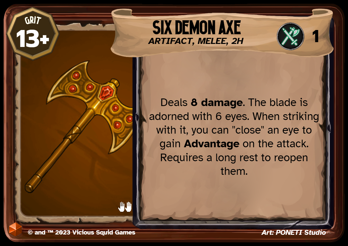
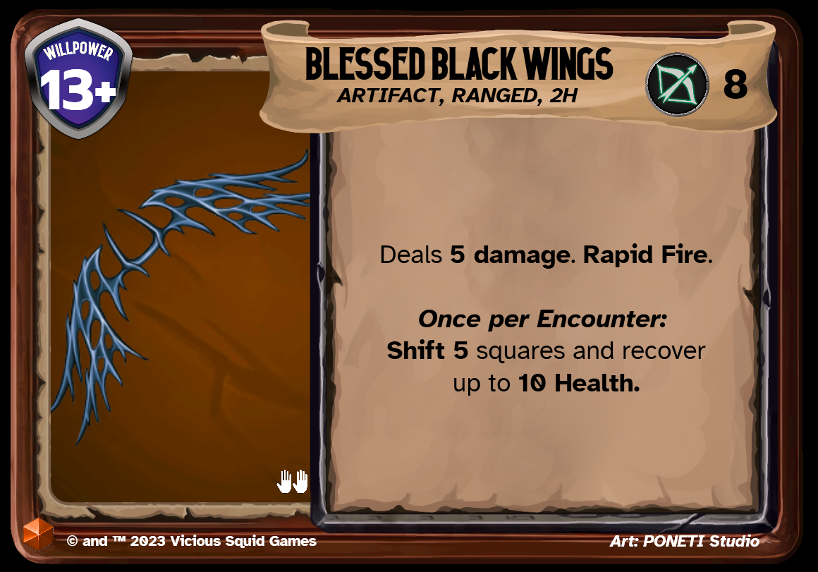
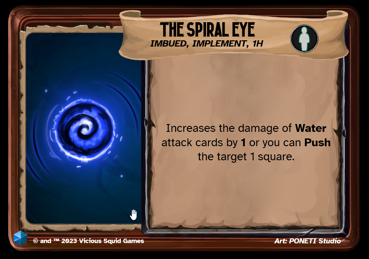
I’ve spent some time this week updating equipment cards to be horizontal i.e. landscape to differentiate them from player character class and origin cards. This makes it more clear that they aren’t supposed to go into your deck and instead are intended to be placed somewhere in front of you. Here are a few sample images, which are still a bit WIP as I update and iterate on the iconography, but overall, I’m much happier with this direction as I get a ton more space for clarity, more words and crazy card mechanics.


